The Style Guide is an excellent tool in the arsenal of frontend developers, and while I’m sure some may debate its usefulness, we all know when we’re browsing for frontend frameworks to base our new project in, we’re looking at the components page of the framework in question or the examples section. We want to see what we will get out of the box for use right away and how much extra work we’re going to need to put in to customize it to our own needs. The same can be said of a style guide. While we can code one by hand, it can be far quicker and more practical to use a style guide generator. It this article we’re going to be configuring and exploring the Atomic Docs styleguide generator, which can be found here: http://atomicdocs.io/
Setup
Drupal 8
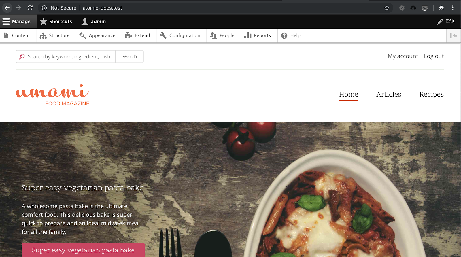
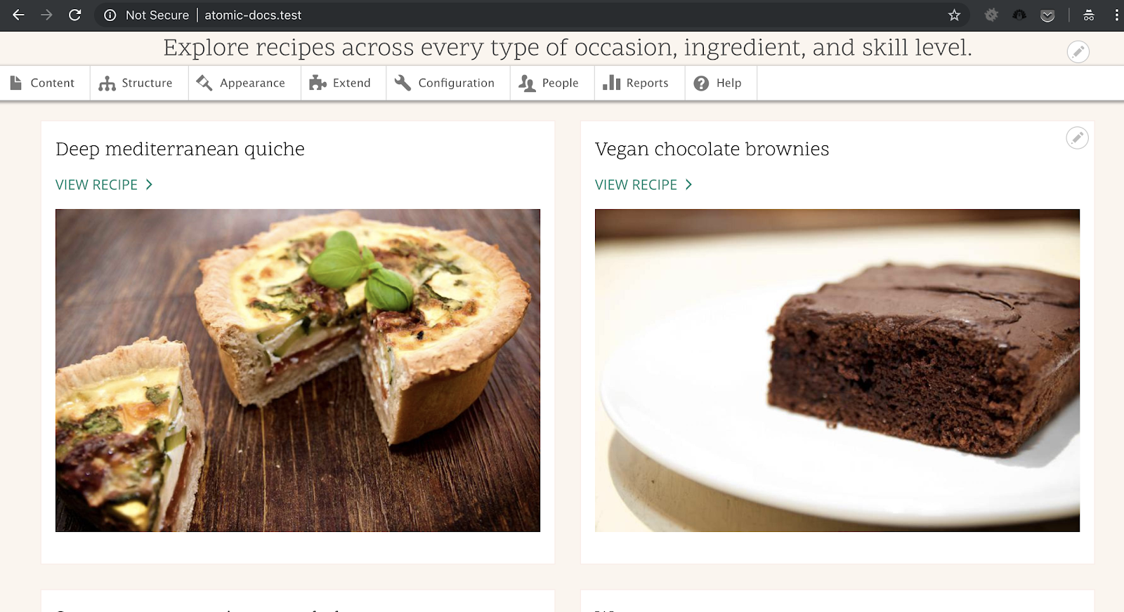
First we’re going to setup a new Drupal 8 project, so head on over to the Drupal site https://www.drupal.org/8 and tap that download button. Now this tutorial does make the assumption that you know how to configure a new Virtual Host with either nginx or apache with PHP. If you do not know how to do this, you should head to Google and watch some basic tutorials on how to do this first. As of this tutorial we’re using Drupal 8.6.1, which comes with an example site “Umami Food Magazine” so we will be using it for this example. You can check for other online tutorials on how to setup Drupal 8.
With Drupal 8 set up and the “Umami Food Magazine” example installed, you should see something like this:
The “Umami Food Magazine” theme is installed under the core/profiles/demo_umami/themes/umami directory. That's is a lot to chew on (no pun intended), and you shouldn’t be modifying things in core, so we’ll extend the existing theme by creating a new sub-theme. To do this, we create a new directory in the themes directory, and we’ll call it “atomic_umami”. We’ll create two files inside of this directory: atomic_umami.info.yml and atomic_umami.libraries.yml and we should end up with the following structure:
themes/
 - atomic_umami/
 -- atomic_umami.info.yml
 -- atomic_umami.libraries.yml
In each file we will put the following
Atomic_umami.info.yml
name: Atomic Umami
type: theme
description: This is a Atomic Docs demo sub-theme of the Umami example profile.
core: 8.x
# The base theme is the umami profile found in core.
base theme: umami
# Our global js/css libraries.
libraries:
 - atomic_umami/global-style
Atomic_umami.libraries.yml
global-style:
 css:
   theme:
     css/style.css: {}
With these two files we’ve specified that our base theme will be the umami profile found in core that we have installed. In our sub-theme libraries we have defined a global library with an applicable libraries file which will house our global style.css
Now comes the fun part where we configure Atomic Docs.
Atomic Docs
Atomic Docs uses PHP and SASS, so you will need to have these set up on your workstation before you can start using it. First we need to clone the repository, you can find it here on GitHub: https://github.com/nickberens360/atomic-docs we will clone this into your theme root.
git clone https://github.com/nickberens360/atomic-docs
Inside the sass directory we’ll place a file titles style.scss. We can also go ahead and copy the site logo from the umami theme into our theme, along with the images directory (failure to copy these in will break the subtheme). Our directory structure should now look like this:
themes/
 - atomic_umami/
 -- atomic-docs/
 -- css/
 -- images/
 -- scss/
 -- atomic_umami.info.yml
 -- atomic_umami.libraries.yml
 --- style.scss
 -- logo.svg
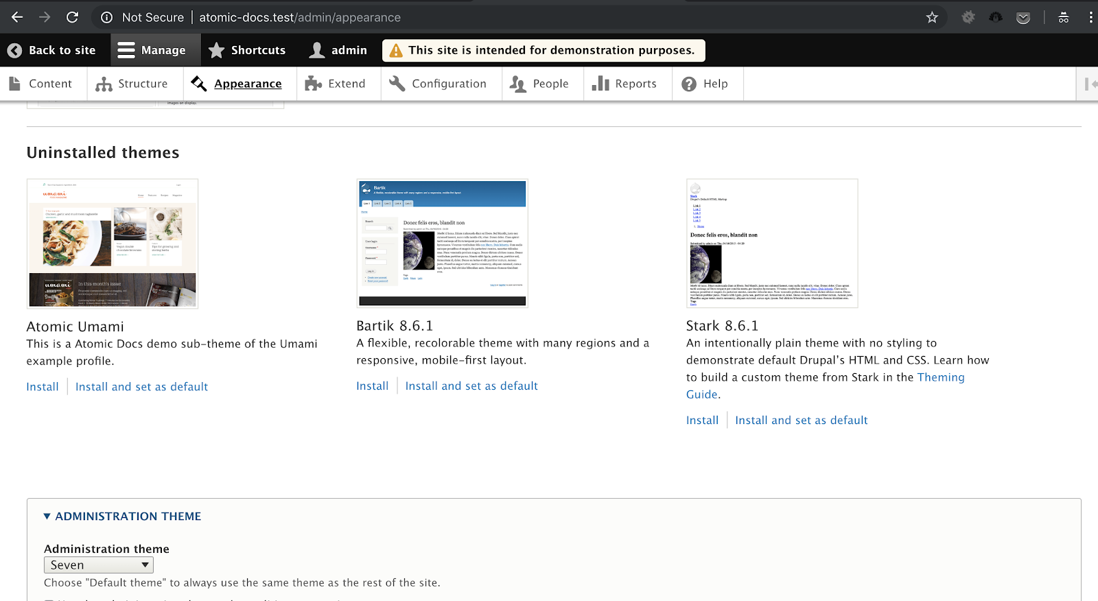
After we have this setup, clear the caches and head to the Appearances section of the site and you should see the new theme available to install, install it and set it as default:
For the purposes of thie example, we will also edit our style.scss file to point to our Atomic Docs scss file, edit the scss/style.scss file to reflect the following.
@import "../atomic-docs/scss/main";
Now we will create another Virtual Host to run Atomic Docs, we don’t want just anyone to have access to atomic docs, and by default just cloning atomic docs will give you an access denied error and we should keep it this way as it’s simple enough to create a simple sub domain. For this I have created a new subdomain using amp called atomic.atomic-test.test and pointed it to the atomic_umami sub-theme directory, either do the same or modify the permissions for your Atomic Docs directory. If you’ve gone the Virtual Host route, browse to your new domain, if you’ve gone the permissions route, browse to the location of the Atomic Docs repo. We should see something like this:
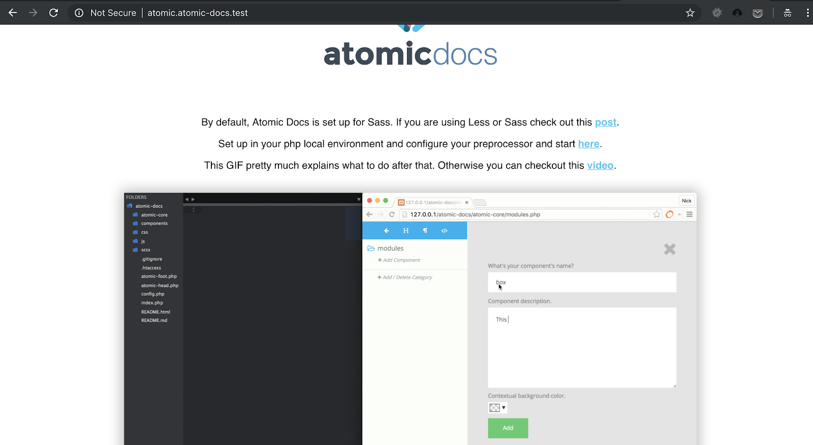
Click on the second link you see on this page titled “Set up your php local environment and configure your preprocessor and start here”, you’ll see the following screen.
Now before we proceed any further, we need to set up our SASS preprocessor to turn our style.scss file into a style.css file. Ordinarily we would use something like Gulp, Grunt or Compass to handle more advanced preprocessing for things like minification, obfuscation if necessary, globbing, linting, js compilation etc, however as this is just an example, we’ll use a cool little app called Scout, you can download it here: http://scout-app.io/ once you’ve downloaded it and got it open, click “+ Add Project” and point it to the atomic_umami theme directory we created, then set the input directory as scss and the output directory as css. We will also need to open a second project in scout so add one more and call it atomic_docs, using the atomic-docs root directory as the project root and the scss and css directories respectively, and click run on both of them. Please not that I do not recommend using the Scout app for any major project, however for small instances or prototyping purposes it’s perfectly acceptable.
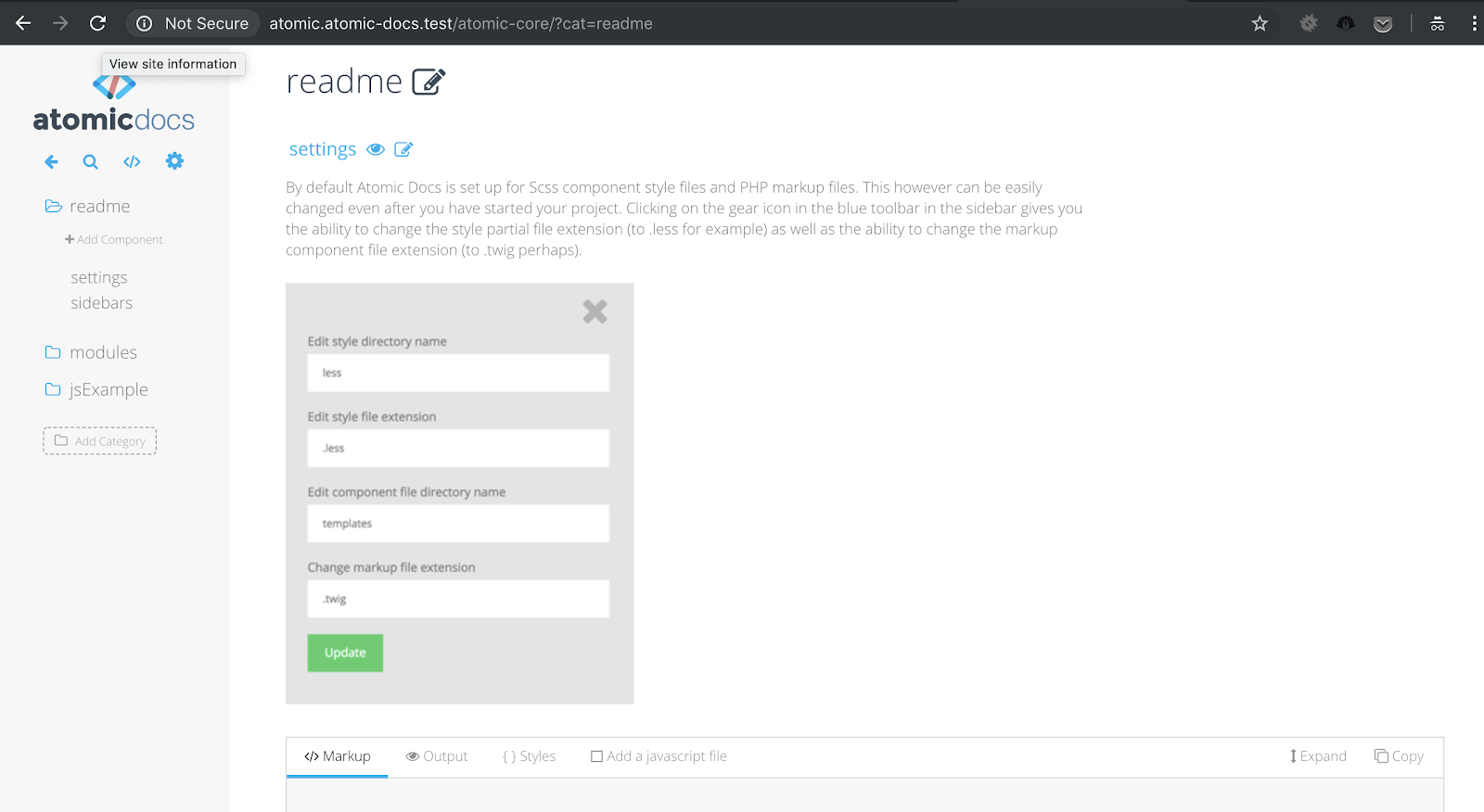
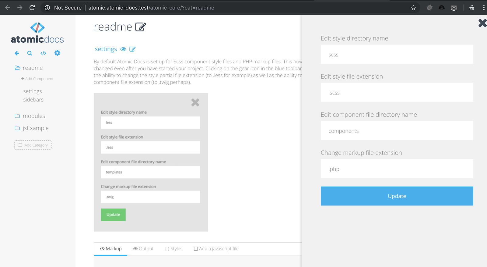
Once you have it configured, click the play button to begin processing. Returning to Atomic Docs, click on the cog in the left pane below the app logo, and you’ll see we don’t need to modify the configuration as we have it all set up the way it wants it:
Now, a quick note, Atomic Docs uses a set of design principles called, you guessed it, Atomic Design! Atomic Design follows along the principle that duplicate code should be completely unnecessary and all things should be broken down into their elementary levels: Atoms -> Molecules -> Organisms -> Templates -> Pages. To read more about it you’d do better to hear it from the designer himself at this blog post: http://bradfrost.com/blog/post/atomic-web-design/ once that makes sense, let’s begin creating some components.
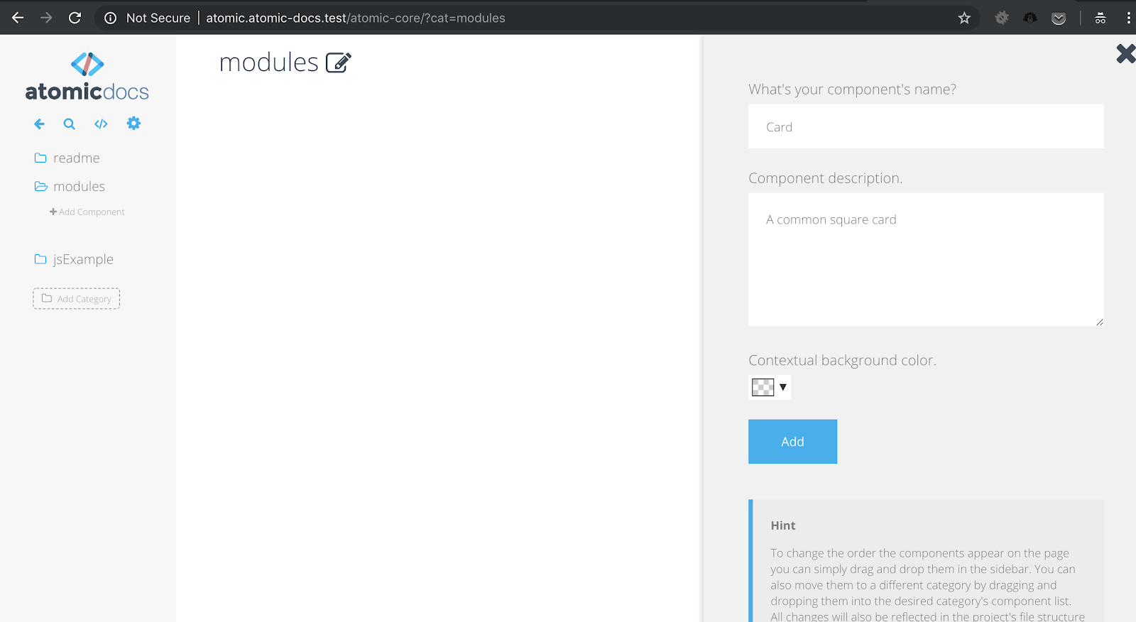
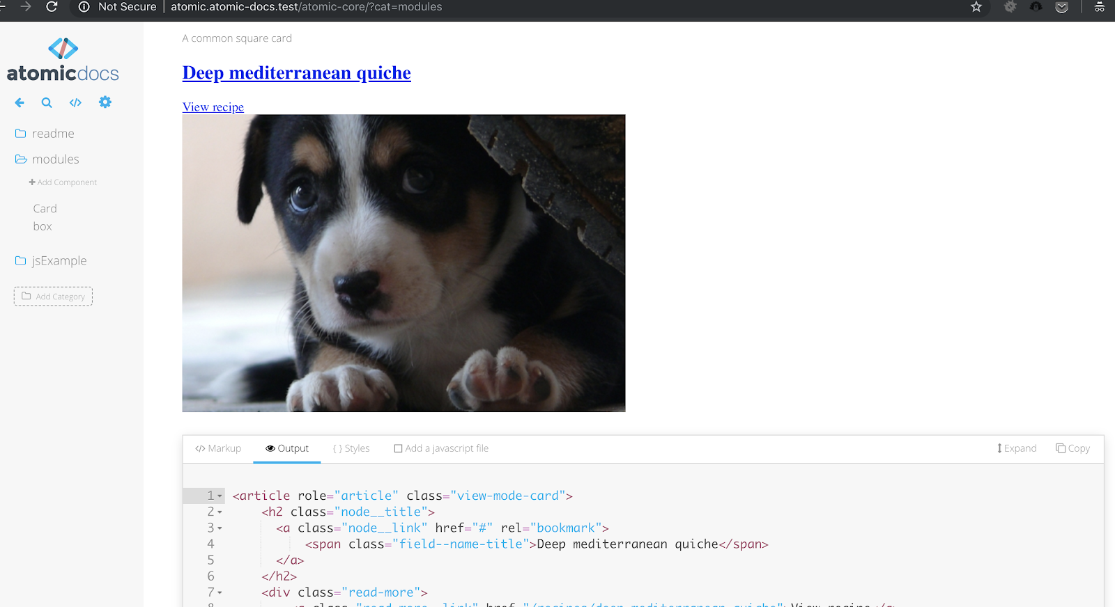
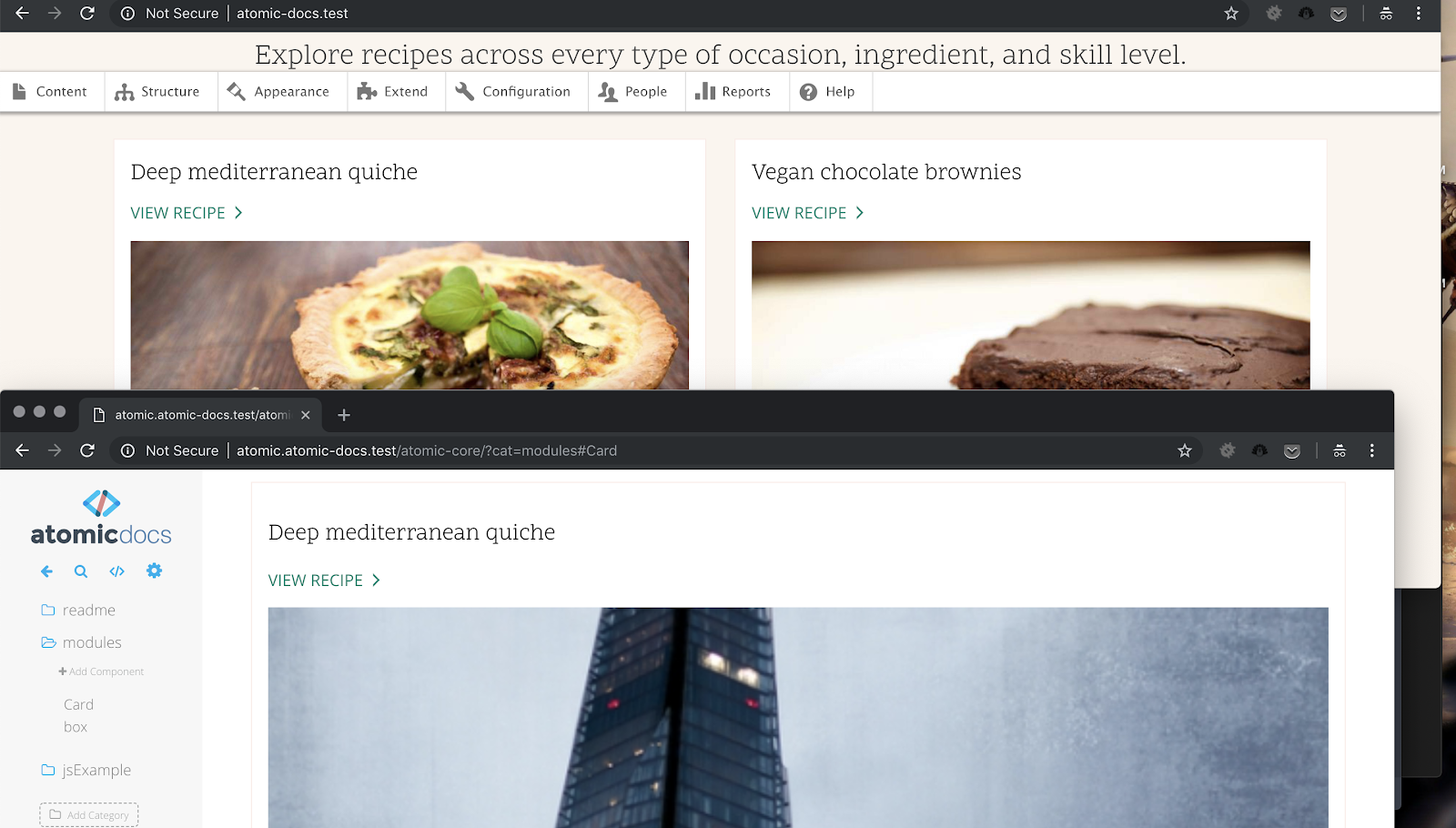
In the left menu below the Atomic Docs logo, we can either create a new Category in which to group our components, or use an existing one, in this case we’re going to use the modules category. Click on the modules category and then click add component, we’re going to add a new component called Card, which will contain the style for the cards we see on the “Umami Food Design” homepage.
For this we can take the source code from the card html element, tidy it up a little and use it as the html code for our element. So paste this code in:
<!-- components/modules/Card.php -->
<article role="article" class="view-mode-card">
   <h2 class="node__title">
     <a class="node__link" href="#" rel="bookmark">
         <span class="field--name-title">Deep mediterranean quiche</span>
     </a>
   </h2>
   <div class="read-more">
       <a class="read-more__link" href="/recipes/deep-mediterranean-quiche">View recipe</a>
   </div>
   <div class="node__content">
       <div class="field--name-field-image"> <img src="https://placeimg.com/550/370/any" alt="A delicious deep layered Mediterranean quiche with basil garnish." typeof="foaf:Image">
       </div>
   </div>
</article>
This is a much lighter version of the card generated by Drupal, as it has the core classes on it that are being used in styling it currently. Once you’ve added this code in, hit save and you should see something like this:
Now that we have our HTML, we’ll apply our styles, click on the Styles tab and then paste in the following SASS code, also note the image being used for the readmore link should point to the SVG relative to the umami base theme.
/* scss/modules/_Card.scss */
@import url('https://fonts.googleapis.com/css?family=Scope+One');
@import url('https://fonts.googleapis.com/css?family=Open+Sans');
$black: #000;
$link-green: #00836d;

.view-mode-card {
   display: flex;
   flex-direction: column;
   width: 100%;
   padding: 1rem;
   border: 1px solid #fcece7;
   .node__title {
       text-decoration: none;
       color: $black;
       font-size: 1.424rem;
       font-weight: 400;
       flex-grow: 1;
       font-family: "Scope One";
   }
   .node__link {
       text-decoration: none;
       color: $black;
       background-color: inherit;
   }
   .field--name-title {
       text-decoration: none;
       color: $black;
       font-size: 1.424rem;
       font-weight: 400;
   }
   .read-more {
       margin-bottom: 1em;
   }
   .read-more__link {
       background-color: inherit;
       position: relative;
       display: inline-block;
       padding-right: 20px;
       text-decoration: none;
       text-transform: uppercase;
       color: $link-green;
       font-family: "Open Sans";
       &:before {
           position: absolute;
           top: 50%;
           right: 0;
           width: 14px;
           height: 14px;
           margin-top: -7px;
           content: '';
           /* Note that here I have pointed the pointer svg to the example site domain name I'm using. */
           background-image: url(http://atomic-docs.test/core/profiles/demo_umami/themes/umami/images/svg/pointer.svg);
           background-repeat: no-repeat;
           background-position: 0 0;
           background-size: contain;
       }
   }
   .field--name-field-image {
       img {
           display: block;
           width: 100%;
           margin-bottom: 1.2em;
       }
   }
}
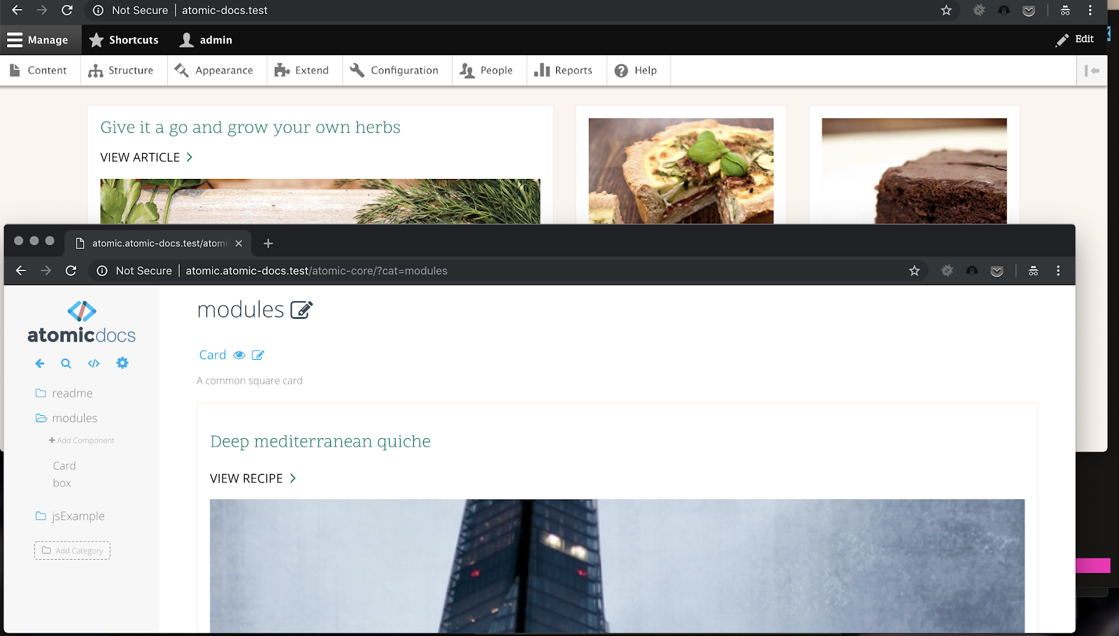
Once this has been done you should see something like this, which reflects the cards that we have on the front page of the example sub-theme we created, here is them laid on top of each other, one from the Drupal site, one from the Atomic Docs instance:
Firstly you will be cursing at the horrible code that I have used, clumping variables together, not using mixins or base level components, however purely for examples sake and to show what is possible, I have done it this way, purely to demonstrate the capabilities of Atomic Docs. What we now have is our Card, we know that the style reflected here in this component we see on the Atomic Docs page, will reflect what we will see on the live site. For instance, we could flip the title and link colors around.
/* scss/modules/_Card.scss */
@import url('https://fonts.googleapis.com/css?family=Scope+One');
@import url('https://fonts.googleapis.com/css?family=Open+Sans');
$black: #000;
$link-green: #00836d;

.view-mode-card {
   display: flex;
   flex-direction: column;
   width: 100%;
   padding: 1rem;
   border: 1px solid #fcece7;
   .node__title {
       text-decoration: none;
       color: $link-green;
       font-size: 1.424rem;
       font-weight: 400;
       flex-grow: 1;
       font-family: "Scope One";
   }
   .node__link {
       text-decoration: none;
       color: $link-green;
       background-color: inherit;
       .field--name-title {
           color: $link-green;
       }
   }
   .field--name-title {
       text-decoration: none;
       color: $link-green;
       font-size: 1.424rem;
       font-weight: 400;
   }
   .read-more {
       margin-bottom: 1em;
   }
   .read-more__link {
       background-color: inherit;
       position: relative;
       display: inline-block;
       padding-right: 20px;
       text-decoration: none;
       text-transform: uppercase;
       color: $black;
       font-family: "Open Sans";
       &:before {
           position: absolute;
           top: 50%;
           right: 0;
           width: 14px;
           height: 14px;
           margin-top: -7px;
           content: '';
           /* Note that here I have pointed the pointer svg to the example site domain name I'm using. */
           background-image: url(http://atomic-docs.test/core/profiles/demo_umami/themes/umami/images/svg/pointer.svg);
           background-repeat: no-repeat;
           background-position: 0 0;
           background-size: contain;
       }
   }
   .field--name-field-image {
       img {
           display: block;
           width: 100%;
           margin-bottom: 1.2em;
       }
   }
}
And we would end up with this:
So, casting aside the poor formatting and style conventions we have used here for example purposes (don’t judge me), we can clearly see that the changes in the style guide are now clearly reflected on the actual site itself.
Summary
To summarize, hopefully this has shown you somewhat a good use a generated style guide can actually be. By developing your styles and checking for changes in your style guide, you will have a full catalog of all the components and scss pieces that your site contains and in the long run, will make things so much easier for developers inheriting your code, when you have to extend it or maybe take a long time off from working on it.
Please take some time to explore Atomic Design as it really is a beautiful principle, however for Drupal projects using a heavy framework the likes of something like Bootstrap, you may find it a little too hard to apply it considering it is meant to be build from the ground up, but if you took the time you may be able to build a reusable atomic companion for your future projects. Good luck and stay sassy!