Installation profiles can be a boon when you require a lot of pre-bundled functionality you would otherwise have to set up and configure individually.
In this article we’re going to be demonstrating accessibility with Drupal 8 and WXT http://drupalwxt.github.io; an installation profile geared towards building accessible websites more efficiently.
Why WXT? It’s backed and used by the Government of Canada and is in active development. For Canadians in Ontario, accessibility is not something to be ignored, it became a requirement by law as of January 2014, if you meet the criteria, to ensure public facing sites meet level A web accessibility guidelines https://www.ontario.ca/page/how-make-websites-accessible and by 2021 they must meet AA web accessibility guidelines.
So having something backed by the government enforcing these new guidelines is comforting along with knowing that web accessibility guidelines are built into the framework.
Before we take a look at WXT though, let’s look at ARIA.
Learning ARIA
ARIA stands for “Accessible Rich Internet Applications”, and while there are plenty of excellent resources, and often very in-depth ones, sometimes they can be a little bit overwhelming, so we will condense it down to the bare bones.
The following article is a great place to start, we will be going over some of the mentioned elementary elements of ARIA here.
Logical Page Structure & Landmark Roles
Web applications and accessibility get on a lot better when there is what is defined as a “logical page structure”. Fundamentally this means that an application page should use specific elements or “roles” in order to break up the page content in a meaningful way.
In a nutshell, like using footers, headers, the main container etc.
To designate and help describe specific areas for assistive technologies, ARIA requires Landmark Roles to be set. These are.
-
banner
-
navigation
-
main
-
complementary
-
contentinfo
-
search
-
form
A role can be set using the role attribute.
While some of these can only be used once in a document, some can be used several times, the rule for multiple instances of a role is to include a label property “aria-labelledby”, which we will get into.
banner
Only one banner role should be set per page and it’s considered as a “top-level landmark” this means it needs to sit in the root of the document inside the body, outside of the main container or content.
<div role="banner"></div>
navigation
The navigation role is used to, you guessed it, designate a form of navigation. This could be a list in a side panel, table of contents, header navigation etc.
If there are multiple instances of navigation on a page, then a label needs to be used. Unlike the banner role, navigation does not need to be “top-level”.
<nav role="navigation"> or <div role="navigation">
For multiple on a page
<nav role="navigation" aria-labelledby="header-nav--label" id="header-nav">
 <h2 id="header-nav--label">Main Menu</h2>
</nav>

…

<div role="navigation" aria-labelledby="toc--label" id="toc">
 <h2 id="toc--label">Table Of Contents</h2>

 <ul>

   ...

 </ul>
</div>
main
The main landmark is used to specify the container that holds the main content of the document, there should be no more than one main landmark in a document and, like the banner, it should be “top-level”, at the root of the document inside the body.
<div id="main-container" role="main"></div>
complementary
The complementary role should be used as a supporting role for the main content, for say a section or perhaps an article nested inside the main content.
Multiple instances can be used and the general rule of thumb applies to add a label when this is the case.
<article id="article-1" role="complementary" aria-labelledby="article-1--label">
 <h1 id="article-1--label">Once Upon A Time In New Orleans</h1>
</article>

<article id="article-2" role="complementary" aria-labelledby="article-2--label">
 <h1 id="article-2--label">Three Years In Reflection</h1>
</article>
contentinfo
The “contentinfo” role is used mainly with footers or other bits of content located near the bottom of a page or article, like footnotes etc. Only one “contentinfo” role can be used in a document, so it should be reserved for a footer section and it should be “top-level”.
<footer id="footer" role="contentinfo"></footer>
search
The “search” role should be used to designate search functionality or tools, replacing the “form” role if a form is a search form. Multiple “search” roles can be used if needed and they should be labelled if so.
<form id="site-search" role="search" aria-labelledby="site-search--label">
 <h2 id="site-search--label">Search</h2>
</form>
form
The “form” role works very similarly to the “search” role, only it is used to designate all other forms that don’t include search functionality.
<form id="contact-us-form" role="form" aria-labelledby="contact-us-form--label">
 <h2 id="contact-us-form--label">Contact Us</h2>
</form>
You can read more about these landmark roles here
Tab Index
HTML introduced the tabindex property, which was limited to the following elements <a>, <area>, <button>, <input>, <object>, <select> and <textarea> a numerical value up to 32767 can be set.
ARIA expands upon this by allowing any element to be included in the tabindex, allowing for unlimited options when tabbing.
<span tabindex="1" class=”tabbable-item”>A Tabbable Item</span>
Dynamic Aria Properties
ARIA also includes properties for use in dynamic design, for pages that might be getting updated in JavaScript via AJAX, assistive technology should be made aware of the changes in order to keep impaired users up to date.
Live Properties
When content is going to be dynamically modified, removed or added, we need to let ARIA know about it so any changes can be made aware of the assistive technology in use to notify the user.
The properties are:
-
aria-live - this is the main property we use to let ARIA know we are intending the region to be dynamically updated, it can have the following priority values.
-
off - this would disable the live property, can be set by javascript to silence the region if desired.
-
polite - this wouldn’t alert the user until they had completed their action.
-
assertive - this is a bit higher in priority in notifying the user of a change, but not overly aggressive.
-
-
aria-atomic - this is used in conjunction with aria-live and can be set to either true or false and will let ARIA know if the user should be alerted to the entire region being updated, or just a specific area.
-
aria-relevant - this can be used to let ARIA know what sort of changes might be happening to the region, the can be:
-
additions - content will be added or appended to the region
-
removals - content will be removed from the region
-
text - text content will be updated in the region
-
all - all of the above
-
-
aria-busy - this property is good to set when content isn’t quite finished yet and you want to wait before announcing to the assistive technology that the region is done processing, it can be set to either true or false.
Input Properties
ARIA Input Properties fields let a user know the constraints of the field, maybe an input field should only contain a number from 1 to 10 for instance. They can also let the assistive technology know the current state of the field and provide feedback to the user.
The following can be used for input fields
-
aria-valuemin - this would be the minimum value an element can have.
-
aria-valuemax - this would be the maximum value an element field can have.
-
aria-valuenow - this would be the current value of a field when using Javascript to update an inputs value property, update this property also.
-
aria-valuetext - this is similar to aria-valuenow only it is more descriptive. Let’s say the value field contained the weight of something, aria-valuenow would contain only the numerical value, aria-valuetext would contain the numerical value and also the weight measurement system.
-
aria-required - for form elements, we can use the required property to say if the field must be filled or now, for ARIA we must also specify an aria-required property, which can be either true or false.
-
aria-invalid - we can give an element a property of aria-invalid on a form update to designate it as improperly entered or filled, to let the assistive technology know there was a problem
<input class="weight-input" type="number" aria-valuemin="120" aria-valuemax="250" aria-valuenow="150" aria-valuetext="120lbs" value="120" required=”true” aria-required=”true”>
For more on ARIA, check out some of these papers and blogs:
Accessible Rich Internet Applications (WAI-ARIA) 1.1
WAI-ARIA Authoring Practices 1.1
Core Accessibility API Mappings 1.1
WXT Setup
First, you’ll need to set up a local installation, for that you will need to make sure you have MySQL set up, a local web server for development with PHP and composer. Run the following command in the location you want to install the project, it will take a while to install so now’s a perfect time to make coffee.
composer create-project drupalwxt/wxt-project:8.x-dev MYPROJECT --no-interaction
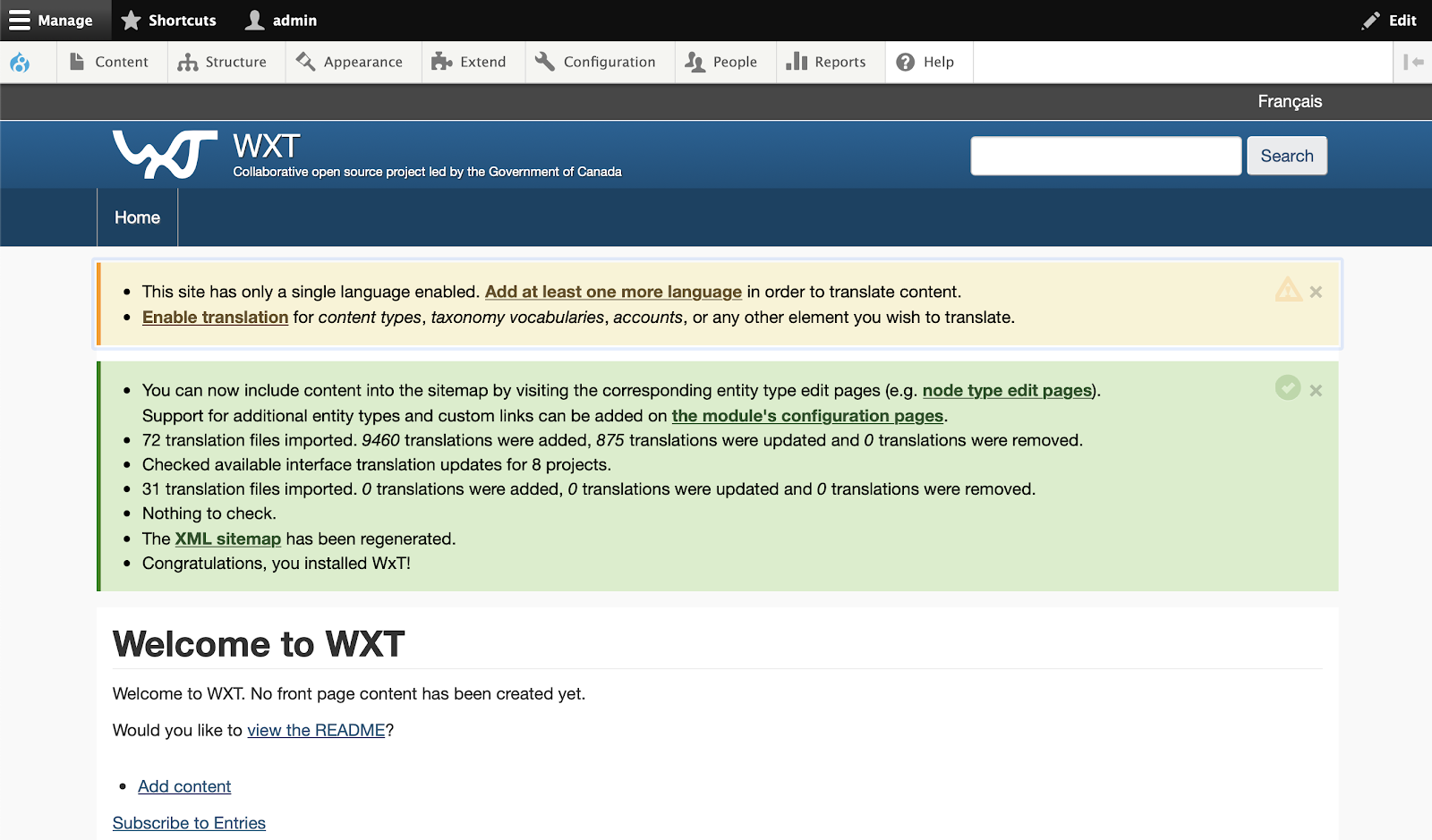
Once installed you should see something like this:
What’s in the box
As far as accessibility is concerned, we get the following:
-
Accessibility/Markup
-
Accessible Bootstrap
-
Accessible WxT jQuery
This is not all that comes bundle, but these should be the selling features, the rest you can read here on the WxT roadmap.
Exploring WXT
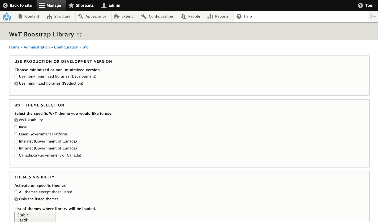
Hover your mouse of the Configuration tab in the admin panel and you’ll see WxT. Click on that, or go to admin/config/wxt/wxt_library this will take us to the WxT Bootstrap Library configuration.Here we get the usual options, we can select production or minimized versions, which theme to use which page to load the theme on etc. We won’t need to concern ourselves with this screen.
If you explore the markup on the homepage, you will notice the heavy usage of ARIA properties, roles, tabindex. The following is some markup taken from the navbar.
<ul class="list-inline menu nav navbar-nav" role="menubar">
 <li>
   <a href="/en" data-drupal-link-system-path="<front>" class="is-active wb-navcurr" tabindex="0" aria-posinset="1" aria-setsize="1" role="menuitem">Home</a>
 </li>
</ul>
What WxT is supposed to help us achieve is making an accessible site easy to achieve without doing too much work, which is why bundled with it in the following directory, is an accessible version of Bootstrap that can be extended and modified: themes/custom/wxt_bootstrap
The best way to extend the WXT Bootstrap theme is to take a copy of the starter kit, which can be found here: themes/custom/wxt_bootstrap/starterkits/wxt
We won’t be creating a subtheme in this article, however, we encourage you to do so if you are considering an accessible project, especially if you are in Canada.
The basics we have outlined in this article should allow you to implement them in conjunction with the WXT framework to create an accessible solution for your project.